Christian Geek Central Forums

Would you like to react to this message? Create an account in a few clicks or log in to continue.

The Online Community Of Christian Geek Central


5 posters

    Need Opinions On CGC Site Layout

    Paeter
    Paeter
    Admin


    Posts : 5708
    Activity : 8030
    Geek-Cred : 60
    Join date : 2010-02-17
    Age : 46
    Location : Mesa, AZ

    Need Opinions On CGC Site Layout Empty Need Opinions On CGC Site Layout

    Post  Paeter July 18th 2014, 12:43 pm

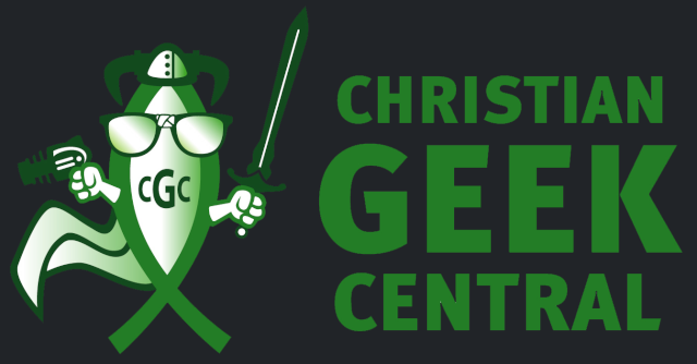
    I'm considering changing the layout(just layout, not color scheme) of christiangeekcentral.com to be more like The Spirit Blade Underground to better showcase the new logo and more clearly "brand" the site.

    The current layout has a small, thin header at the top, which I'm not sure would be best for our new logo. I like the clean look of the current CGC layout, though.

    What do you think? Should I make the change to better showcase the new logo, or should I try to modify the logo to fit the long, thin header allowed by the current layout? Any other thoughts or ideas?


    _________________
    -Seek The Truth!

    www.spiritblade.com
    CreatorsPixels
    CreatorsPixels


    Posts : 182
    Activity : 236
    Geek-Cred : 8
    Join date : 2010-10-19
    Location : Ohio

    Need Opinions On CGC Site Layout Empty Re: Need Opinions On CGC Site Layout

    Post  CreatorsPixels July 19th 2014, 6:19 pm

    If you have a logo you like and you plan to use it other places than the site, then I wouldn't change the logo. If you do it likely won't work as well with everything else you have planned for it. I can't see how it would hurt changing the site layout. It is simple and I have no issues with it but as long as by changing it you don't make it worse I think it would be fine. Maybe you can just change one sample page to get a feel for it. Then post that as a poll or something? Good luck!
    ComiKate
    ComiKate


    Posts : 326
    Activity : 410
    Geek-Cred : 21
    Join date : 2012-07-01
    Location : Netherlands

    Need Opinions On CGC Site Layout Empty Re: Need Opinions On CGC Site Layout

    Post  ComiKate July 21st 2014, 4:46 pm

    I like the clean look & feel of CGC. I find it easier to navigate than Spiritblade Underground, although that has nothing to do with the position of the logo but rather with the different overall layout (more "clutter") and the darker color scheme of SBU.
    So as long as you keep it clean, I think repositioning the logo to a more center stage position is fine.
    Paeter
    Paeter
    Admin


    Posts : 5708
    Activity : 8030
    Geek-Cred : 60
    Join date : 2010-02-17
    Age : 46
    Location : Mesa, AZ

    Need Opinions On CGC Site Layout Empty Re: Need Opinions On CGC Site Layout

    Post  Paeter July 21st 2014, 4:57 pm

    CreatorsPixels wrote:If you have a logo you like and you plan to use it other places than the site, then I wouldn't change the logo.  If you do it likely won't work as well with everything else you have planned for it.  I can't see how it would hurt changing the site layout.  It is simple and I have no issues with it but as long as by changing it you don't make it worse I think it would be fine.  Maybe you can just change one sample page to get a feel for it.  Then post that as a poll or something?  Good luck!

    Making a sample page might be tricky, but the layout would look very similar to The Spirit Blade Underground but with CGC color schemes. And this at the top:

    Need Opinions On CGC Site Layout GreenCGC


    _________________
    -Seek The Truth!

    www.spiritblade.com
    Paeter
    Paeter
    Admin


    Posts : 5708
    Activity : 8030
    Geek-Cred : 60
    Join date : 2010-02-17
    Age : 46
    Location : Mesa, AZ

    Need Opinions On CGC Site Layout Empty Re: Need Opinions On CGC Site Layout

    Post  Paeter July 22nd 2014, 8:41 pm

    ComiKate wrote:I like the clean look & feel of CGC. I find it easier to navigate than Spiritblade Underground, although that has nothing to do with the position of the logo but rather with the different overall layout (more "clutter") and the darker color scheme of SBU.
    So as long as you keep it clean, I think repositioning the logo to a more center stage position is fine.

    Okay, I've "de-cluttered" the SBU blog a bit now. Can you guys take another look at it and let me know what you'd think of the CGC site having the same layout(but with CGC colors and the above CGC logo at the top-center)?


    _________________
    -Seek The Truth!

    www.spiritblade.com
    ComiKate
    ComiKate


    Posts : 326
    Activity : 410
    Geek-Cred : 21
    Join date : 2012-07-01
    Location : Netherlands

    Need Opinions On CGC Site Layout Empty Re: Need Opinions On CGC Site Layout

    Post  ComiKate July 25th 2014, 6:34 pm

    Wow, that's some de-cluttering you did there, that's a great improvement! cheers 

    As for your question, I still think your original idea is fine, as long as the nice clean look of the CGC homepage won't disappear into virtual nothingness…  Wink 
    mindspike
    mindspike
    Admin


    Posts : 836
    Activity : 1035
    Geek-Cred : 39
    Join date : 2010-08-24
    Age : 49
    Location : Evansville, IN

    Need Opinions On CGC Site Layout Empty Re: Need Opinions On CGC Site Layout

    Post  mindspike July 26th 2014, 10:23 am

    Try it. Shrinking the logo I mean. Don't shrink the words, just the image. If you can adjust the height of the header bar, you might be able to find a compromise you like.


    _________________
    -Winston Crutchfield
    http://criticalpressmedia.com
    Paeter
    Paeter
    Admin


    Posts : 5708
    Activity : 8030
    Geek-Cred : 60
    Join date : 2010-02-17
    Age : 46
    Location : Mesa, AZ

    Need Opinions On CGC Site Layout Empty Re: Need Opinions On CGC Site Layout

    Post  Paeter August 1st 2014, 6:33 pm

    mindspike wrote:Try it. Shrinking the logo I mean. Don't shrink the words, just the image. If you can adjust the height of the header bar, you might be able to find a compromise you like.

    I can't adjust the height of the header bar. A notorious limitation of the current layout. But when I find some time I'll try shrinking the image and re-positioning the text of the new logo(the stacked text wont fit) and then I'll see what you guys think. Thanks!


    _________________
    -Seek The Truth!

    www.spiritblade.com
    Tim
    Tim
    Moderator


    Posts : 210
    Activity : 258
    Geek-Cred : 4
    Join date : 2010-07-02
    Age : 42
    Location : New Orleans, LA

    Need Opinions On CGC Site Layout Empty Re: Need Opinions On CGC Site Layout

    Post  Tim August 2nd 2014, 6:26 pm

    I really like the current CGC layout. Like Kate said, it's clean, simple and easy to navigate. There has to be some way to modify that header to give us some better real estate for the graphic. I'm gonna look around and see if I can't offer a better suggestion.


    <><


    _________________
    ...

    ><> ><> ><> <>< ><> ><>
    Be BOLD

    PS 144:1
    1COR 4:20

    ><>

    Sponsored content


    Need Opinions On CGC Site Layout Empty Re: Need Opinions On CGC Site Layout

    Post  Sponsored content


      Current date/time is April 29th 2024, 7:51 am